Blog

  • Search data backs up eBay starting to stop the rot

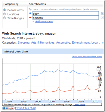
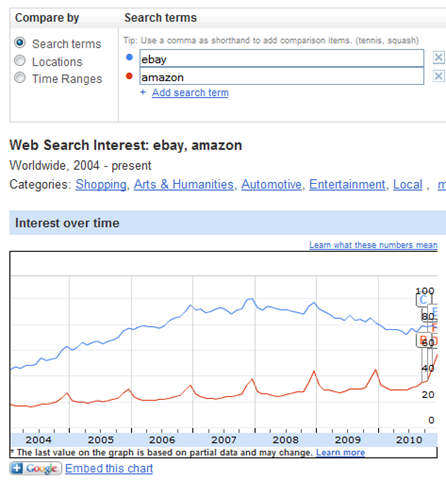
    I love what you can find in the Google Insights data:

    The blue line on the above graph was plumetting throughout 2009 but in 2010 eBay really seems to have stopped the rot and it’s great to see. This data (I believe) is a great guide to people’s intentions and interest and it just shows eBay is winning back attention (and of course the red line shows amazon’s growth and momentum just keeps on growing).

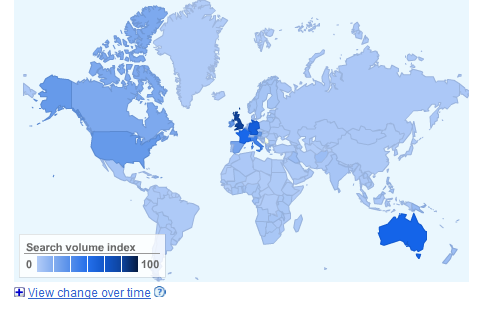
    Another interesting point that people miss is the geographic spread of eBay:

    Look at how powerful eBay really is in Europe. 3 years ago when I left eBay was #1 brand in Germany and was 45% of ecommerce in Italy. Come on eBay, you can grow back 🙂 just like this guy says:

    Get my marketing cheat sheets at Click Here
  • Two nations seperated by a common language in search

    “Two nations divided by a common language” is a quote often attributed to George Bernard Shaw and I think it’s a pretty good one. In general going global for websites is pretty easy and I have been lucky enough to get lots of traffic for my websites from all the english language speakers around the world. That being said even with english language sites there are super interesting differences. I have spent my time on cocktailmaking.co.uk optimizing for the word cocktails and phrases like cocktail recipes (which I am lucky enough to own in the UK) and “vodka cocktail recipes” etc…

    In general I strongly believe that users from different countries are more similar that different. They all want great service, the web is better for all of them when experienced with their friends and a big red button will get anyone to click :). That being said you have to be careful about the details of how you approach things. When british people are looking for a cocktail they search for “cocktail recipes”, “vodka cocktail recipes”, etc… 5x more than “drink recipes” When Americans are doing the same they search for “drink recipes” 3x more than “cocktail recipes”. My british bias made me optimize for the wrong words on total volume.

    Get my marketing cheat sheets at Click Here
  • Crowdsourcing rudeness ratings in cocktailmaking.co.uk

    One big issue I had last year is that I was thrown out of adsense for my cocktail site because of rude content. It turns out a lot of cocktails have rude names. As far as adsense is concerned “Sex On The Beach” is ok but some cocktail names are really not ok. That makes sense and I can understand advertisers not wanting to appear next to rude content. The issue for me is I have 10k user submitted cocktails and I am 5k behind in terms of reviewing and rating them.

    In order to solve this I defined all new cocktails as “rude” (rudenessid == 3 in my database) and then added a section at the top of each new cocktail asking users to review them. Then once a week I send myself a summary of the “unacceptable” and “rude” cocktails via email for me to go in and clean them up.

    The below gives an idea of how much data and how many reports are flooding in to help me fix this 🙂

    Users are super helpful and I have found overall that the crowd comes up with great accuracy each week. Especially when one of my facebook connected users review the content I can really trust user feedback on this front. I am still tuning the system but suddenly users are reviewing more cocktails each week than I have added AND the reviews concentrate in on the cocktails that are getting the most traffic. This really helps me keep the site clean in a crowd sourced manner. My friend Javi has an expression “work to not work” and this is a great example (in my opinion) of that!

    Get my marketing cheat sheets at Click Here
  • This disgusts me or maybe it just makes me sad

    I am always looking for new ways to monetize my sites. I have 0.5MM users visiting monthly (give or take) but only make $10k’s a year. Not really a great ratio (according to my friends). As such I was interested to see what the following company was doing by buying adsense on my site.

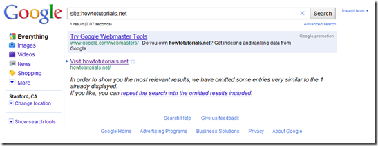
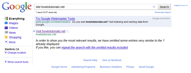
    For those of you who can’t see the text says “I accept the Terms & Conditions for $9.99/mo billed to my cell until I cancel for Access to How To Guides” and is clearly placed in a very hard to read font over an orange background. This sucks. They also do a really good job of retargeting you back to the article you were interested in if you close the browser and navigate to their homepage. The form too is super well optimized (in my opinion). Whoever does this is very good at what they do. Interestingly it seems the Google search index considers them spam, they are barely in it at all:

    I can totally see how (were I to do this on paper airplanes and cocktail recipes how I could get rich quick. There is no question I could game this to get a few % conversion and even if everyone cancelled after one month I’d make 10ks a month. I just feel it’s pretty immoral and now I am making money off this and my users are getting deceived through adsense. This isn’t adsense’s fault, how are they supposed to police this and even then it’s borderline whether this is illegal/in violation of their terms or not.

    Last year I deselected all deceptive ads from adsense and I recently ran the numbers on those. I think I cost myself $20k in the last 12months . That being said even with the following settings I couldn’t block the above ad:

    I have now made “howtotutorials.net” a blocked site for my ads and I don’t blame adsense at all. To be clear it’s the recurring billing and minimized terms I dislike. I think it’s ok to say “pay me XX through your cell to view your content”, that’s a pay wall and raising one of those is your decision as a webmaster. I just feel sad that so much of advertising on the internet is like this. We should be better. I need a new business model.

    Get my marketing cheat sheets at Click Here
  • Great onsite merchandising by Google

    For another article I wrote on some deceptive content in my adsense units I took the following screen dump

    image

    I think this is great work by someone at Google and would love to meet whoever is responsible and learn from them. This ad is perfectly contextual and in the moment. I bet it has amazing response rates and probably drove a lot of growth for their webmaster tools. Also in general it reminds me of a great point from Andy Beal… people who visit your site via “allinurl:” or “site:” are probably webmasters and most likely competitors.

    That data is useful 🙂

    Get my marketing cheat sheets at Click Here
  • Creating country level heatmaps in Python

    I love the maps in Google Analytics and I think the Google Charts API has some great maps rendering. That being said I have a couple of hangups with them:

    1. Google Analytics is designed for a snap shot view and so won’t give you a heatmap of GROWTH. I think that trends in analytics data are more important than snap shots.
    2. I want to create my own code to produce the map I want locally without connecting to the internet or relying on Google chart API

    Last week I was browsing the Flowing Data website and came across a tutorial into creating a heatmap by county in the USA. I just thought it was totally awesome and it inspired me to do a mini-hackathon at work and produce my own heatmap of countries across the world. Sadly I can’t share with you what I was using it for at work (penetration, weekly, monthly and yearly growth by country for Facebook) so I decided to throw one together using Google Analytics data for one of my sites and produce my own little tutorial (with structure shamelessly stolen from the tutorial I mention above):

    Step 0: System Requirements

    This was done on windows using command prompt but works on macs or linux too.

    You need:

    That’s it

    Step 1: make a couple of edits to the svg file

    Open up the SVG file. Within it there are paths and groups of paths. Each path at the top level of the XML tree is a country with a single land mass. Each group is also a country and each path within that group is a land mass for that country (for example ar has 5 land masses in the map in this file):

    image

    There was one issue I couldn’t get over/was too lazy to deal with in code so I just hacked it in the file: Somehow beautifulsoup munges the data around greenland (feel free to skip this step and see what happens, you can always fix this later). The way I dealt with this was to go to line 1962 and 1963 and removed them I then went to line 2367 (2369 before the two deletions above) and removed the </g>.

    Step 2: create your country level data from Google Analytics

    The following graphic shows you where to pull the data by country from your Google Analytics account. I strongly suggest that you set the drop down (found at the bottom right of the page) to 500 so when you download you get a full list of countries and not the default ten countries.

    image

    I grabbed the data for all countries from June 28-July 28 2010 and from June 29 – July 29 2009. There are two bits of data processing that need to be done to this data:

    1. map the 2009 data to 2010 data by country and calculate the delta % (I did this in excel) and save it to a file called “growthratebycountry.csv”
    2. map the country names that analytics gives you to 2 letter country codes used in the svg file (I have included this list as a csv file in the zip file I give you at the end of this tutorial)

    Step 3: create your python script, I called mine runner.py

    that is all 🙂

    Step 4: import needed modules

    We will need to import the csv file with the year on year growth rate and we will need to import the svg file then read it into BeautifulSoup to parse it. As such we have to import the csv and BeautifulSoup modules at the start of our python script.

    image


    Step 5: read in your country level data

    First you need to set up the penetration dictionary. Then choose the file you want to read in and set the delimiter “growthratebycountry.csv” is the name of the csv file I saved the growth data to and “,” is the delimiter. Finally you need to loop through that and for each row set the key for the penetration dictionary equal to the first column (containing the country 2 letter id) and the value to the second column (containing the % growth)

    image


    Step 6: read in your map and load into BeautifulSoup

    I saved the edited map above to “countries.svg”.

    One thing that’s special about BeautifulSoup is that you need to tell it which tags are self closing and so the 3 tags mentioned in “selfClosingTags=” are the 3 tags in this file that are self closing.

    image


    Step 7: set up your country color levels

    Flowingdata.com pointed out the awesome service: http://colorbrewer2.org/ which allows you to pick a color list.

    Given I am a Facebook boy I decided I like blue for my color palette. I put this into a list, numbering starts from zero so colors[0] = “#9ECAE1”. We will use this later to color in the map.

    image


    Step 8: Find all the countries using BeautifulSoup

    There are two sets of countries as mentioned above. Those with multiple land masses (enclosed in “g”) and those with single land masses (enclosed in “path”). Beautiful soup has a function “findAll” that allows you to find all occurrences of a certain XML tag. By default recursive is set to True which means that for the xml tag ‘path’ it will find >1000 (i.e. one for each land mass not each country). This is clearly sub-optimal. Setting recursive=True will allow you to pick only the top level nodes which are all countries.

    image


    Step 9: Replace the style for every country with the colors you have chosen

    Set the basic style you will want each node to have and end it with “fill:”. We will subsequently be adding a hexadecimal color onto the end there based on the growth rate.

    image

    Now for each of the paths you selected in Step 8 run through them and update the color if there is a penetration with that id. I have specifically here included “if ‘land’ in p[‘class’]:” since the only paths we want to recolor are those which represent land masses and in this file they always have the class “land XX” (where XX is the country id, e.g. ‘gb’). The style attribute of each node is accessed via “p[‘style’]”.

    image

    Finally we need to go through all the countries represented by groups of land masses and update the color for all of their individual land masses:

    image

    The part at the end “for t in g.findAll(‘path’, recursive=True):” loops through ALL the sub-paths within a group and updates their style to match the color that we want the group to appear. Note this is different above where we set “recursive=False”.

    Step 10: Output this to file and correct one issue

    The last step is to write this out to a file. In this case I have called the file “newfile.svg”. The code str(soup) outputs soup as a string. You have various other options here such as soup.prettify() which you can look up yourself but I prefer this (for no particular reason). The “.replace(‘viewbox’, ‘viewBox’, 1)” is there since BeautifulSoup converts all attributes to lower case when rendering. Unfortunately svg requires that viewBox is capitalized as below and so I have found to get the maps to render correctly in firefox you need to make this replacement.

    image 


    Step 11: run the script

    All the files involved here: “countries.svg”, “growthratebycountry.csv” and “runner.py” need to be in the same directory since I have only used relative locations of paths and not absolute. Once that is the case, navigate to the folder they are in and run “runner.py” using the command “python runner.py”.

    image


    Step 12: View your beautiful “newfile.svg”

    As you can see I have a lot of growth in the Ukraine 🙂 and since I have limited this to only countries with >100 monthly visits you can also get an indication of the reach of my website worldwide.

    image

    You can download the complete source code (including countries.svg, countrymapping.csv and my growthratebycountry.csv) here.

    Anyway I am really proud of this and am spending all my time at the moment making country level heatmaps for everything I can at work. I hope you can now too 🙂 and if you like seeing a growth based view of your google analytics data try my new application “fast moving keywords”. I definitely intend to include this map in it going forward, once I have worked out how to output an svg as a png using python!

    You can always make a cocktail to celebrate when you finish this too using the cocktail site analyzed above.

    Get my marketing cheat sheets at Click Here
  • Facebook could eat the web – the Steve Rubel lifestream

    Like almost everyone else on the planet, it seems, I am spending more time on Facebook than any other site. The lone exception is Google. The reason I know this is that Safari, my browser, lists Facebook as my most visited site when I access its top sites feature.

    via www.steverubel.com

    I think this is a genuinely important article to read. One data point which doesn't get bandied about in the west is how vkontakte is something approaching half of the page views on the web in Russia and as such is altering the web landscape fundamentally across many web industries. The web is changing a lot as is media right now and the big trend is interactivity.

    This becomes doubly interesting when you think about how in the past even with search engines everything is really content being shared to you and not content you participate in.

    I am not sure how I am going to make the most of this but my next revision of cocktailmaking.co.uk is going to have social and connect deeply integrated into it. We'll see how that goes!

    Get my marketing cheat sheets at Click Here
  • Conan O’Brien gathers Facebook army for huge TV comeback

    "We have an army on Facebook who will do whatever it takes to make Conan #1 when he starts back up in September," he told HuffPo.

    via www.businessinsider.com

    This is a really great article to set you thinking about the leverage of social networking. With an audience of 400MM people now on Facebook and a system optimized for efficient flow of information great ideas and topics over which people are passionate can spread fast and get a huge support base. Those people who understand how to leverage the base (like Chris Hughes did for Obama) are going to do very well because of this!

    Get my marketing cheat sheets at Click Here
  • Median vs Mean Part 2: CUME vs GRP in offline media and what it means for internet marketing

    One thing has been true for as long as marketing has been around: It doesn’t matter how good your ad is if no one sees it.

    Dave Goldberg (CEO Surveymonkey) gave a great talk at an event I was at recently and shared an anecdote about MTV’s audience on 30min shows vs 5min music videos that is worth repeating and set me thinking a lot more about reach and frequency in internet marketing.

    GRPs vs Cumulative Audience Rating

    In television measuring how many people see your ad is done using set top boxes and often a combination of “gross rating points” (crudely: what % of the possible TV audience sees a given show, detailed description linked below) and cumulative audience rating (similar but what % watched a show in 15minute segments of that show).

    In the 1980s MTV did great on GRPs because people would tune in to catch a 5minute video. The problem for MTV came when cumulative audience became a big measure in the 1990s, people just weren’t sticking around for 15minutes. If you followed a Stone Roses track with Madonna the two audiences were not the same and so the stone roses people switched off and by the time you reached the break (where the ads which funded the show were) MTVs audience was a fraction of it’s GRPs because the cumulative audience (who watched for a full 15minutes up to the break) was small since you just don’t like every video in the hot 40.

    The following slide (from this presentation: http://www.scribd.com/doc/3046688/ANALYSIS-Audience-Cross-Rating) shows even today how rapidly the audience figures drop off with time on a given channel (MTV, MTV2 and CBS).

    image

    With 30minute shows like Beavis and Butthead MTV managed to get an audience that stuck around through the commercial break giving the ads greater exposure and making marketers really happy. Not only that but their audience seemed to love them too and their total GRPs went up too which led in many ways to the Hills etc… etc… and a lot more revenue for MTV.

    MTV optimized to drive up their median user by changing their show format. They did not optimize to drive up their mean user by making their 5minute videos so perfect that the folks watching 1hr a day would watch 2hrs. This was a great decision.

    So how does this apply to Internet marketing

    In display media for internet marketing people buy impressions but this is really nuanced. You should not be just buying “impressions” you should be focusing hard on what the reach of those impression are and ensure whoever you buy from gives you a frequency cap. Below is the distribution of visits on my paper airplanes site in the last 30days.

    image

    As you can see if you want to hit 160k people with my site you can BUT after the first impression you will only be reaching 90k people and by the 4th impression you will only be reaching 54k people. I could make total delivery of impressions huge while still only giving you a small reach by not giving you the first 4 impressions. Frequency caps matter a lot.

    Conclusions

    In order to maximize the chance of your ad doing well you have to maximize it’s audience.

    Understanding the data you are using to determine reach is therefore very very important.

    Anyone who can offer great reach and high frequency will make a killing in advertising sales and THAT is a challenge of optimizing for the median user (in paper airplanes case the person who see 2 page views) and not the mean (who in paper airplanes sees 6 page views).

    Planned posts:

    • The key to understanding your website
    • Diminishing return on user value against page views per user
    • Cume vs GRP in offline media and what it means for internet marketing
    • How to optimize for the median

    I hope you stay with me and read them all 🙂

    References:

    Cumulative Audience Rating: http://www.answers.com/topic/cumulative-audience-rating

    Cumulative Audience: http://www.answers.com/topic/cumulative-audience

    Gross Rating Point: http://www.answers.com/topic/gross-rating-point

    Presentation on MTV time on channel: http://www.scribd.com/doc/3046688/ANALYSIS-Audience-Cross-Rating

    Get my marketing cheat sheets at Click Here
  • Part 1: Median vs Mean – the key to understanding your website

    My latest hobby horse is focusing on the basic difference of median vs mean. My belief is that for content based sites who make their revenue from ad sales (like YouTube, Yahoo, Gawker, Newpapers etc…) a focus on optimizing the median page views per user is far more important than optimizing to increase the mean. It is worth noting that sites like Google (where the goal is to get you to leave the site by clicking on a demand fulfillment ad), eBay or Amazon this is not true.

    I am going to try and post a number of articles with data from my own sites that show this but I am going to start with one simple post that quickly gives two examples of median vs mean page views per user and resulting revenue per user.

    PaperAirplanes.co.uk

    My AVERAGE (mean) page views per user on paperairplanes.co.uk is 4 (it’s gone down a bit since I’ve focussed a lot on videos) and it’s pretty stable.

    image

    My median page views per user is only 2, half the mean:

    image

    CocktailMaking.co.uk

    My AVERAGE (mean) page views per user on cocktailmaking.co.uk is 8 (it’s gone down a bit since I’ve focussed a lot on traffic generation in the “cocktail name” space where people come in, view the cocktail then leave) and it’s pretty stable.

    image

    My median page views per user is only 1, 1/10th the mean:

    image

    Revenue per visitor

    Paper airplanes has a revenue per visitor of 2.1x Cocktail Making and hopefully through the coming posts I will be able to prove to you that this is due to the fact cocktail making has a lower median page views per visitor than paper airplanes even though it’s mean page views per visitor is 2.5x that of cocktail making.

    Perhaps this is all very obvious to you and if so I apologize… don’t read the series but if this is all so obvious why do none of the big analytics providers include median by default into all their metrics?

    Planned posts:

    • The key to understanding your website
    • Diminishing return on user value against page views per user
    • Cume vs GRP in offline media and what it means for internet marketing
    • How to optimize for the median

    I hope you stay with me and read them all 🙂

    Get my marketing cheat sheets at Click Here